


Our next group meeting is on
Saturday July 4th 12-3 and Friday July 10th 12-3 PM & 6-9 PM
Please bring some photos to art journal this month. I will have some paints for us to play with!
June Theme
Travel Journaling June 27 Art Challenge: Photos and Words Journal Prompt: A Picture is Worth a Thousand Words
Here is how Sandi Keene took on the challenge. Link to her blog
Long ago I worked for a company that created Mosaic Moments. When I read this prompt, I immediately thought of a mosaic as it is such an interesting way to present a photo. I contacted the owner, Tami Potter and she sent me out some mosaic paper. (Thanks, Tami!)

I started with the basics for a mosaic - Mosaic Moments self healing gridded mat, exacto knife, cork backed metal ruler and Herma repositionable adhesive.

I printed a vacation photo (5" x 5" but any size works) I loved of my husband in a swing on the porch reading a book and pausing regularly to look at the stunning mountain views. In delightfully cool temperatures. With hummingbirds buzzing around the feeder on the porch. Can you say PERFECT?!
I cut the photo into one inch squares using the mat, exacto and ruler. It takes less than a minute. The system is designed for easy success.

Now I transfer the squares onto the gridded paper that lines everything up.

Hello, mosaic!

I had an idea of exactly how this was to look when I was done. Now came the hard part of transferring that idea onto paper. Incorporating the mosaic into art was always my plan. I sketched out a basic plan for where the elements were to be. And then I started painting.
  
A picture is worth a thousand words!
Want more info on how to create a mosaic? This short video shows the process step by step.
You can join our group meetings at any time, but you do need to call us to get your name on the list.
I want to be sure we have room for everyone.
When you come to the group meetings, please bring your paper towels, heat guns, paint brushes, adhesives and color mediums of choice. |


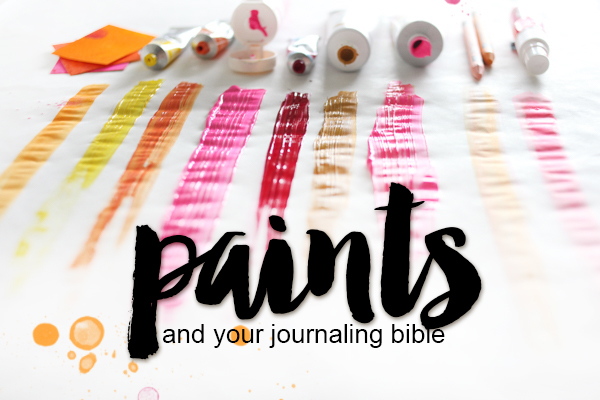
Hi there! Thank you so much for all of your kinda comments and excitement over the last resource post; what’s the difference Wednesday | inks. As I stated before one of the questions I get the most on social media about my bible is WHAT am I using and HOW am I doing it. Whenever I post a photo where I have used paint I get a ton of questions, so I knew this had to be one of the topics we covered in this series!
I am showing you how I use my paints, which paints I use in my bible and most importantly the backside of those thin pages after I use it! If you have any questions please feel free to post in the comments!
I will be linking you up to products where possible, and these links will be affiliate links on Amazon. This means I get a small percentage of each sale and we use that money to keep tutorials like this fresh and useful! Thank you so much for your support!!!
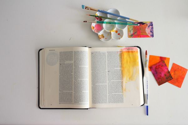

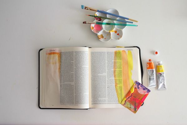
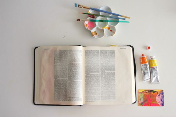
I use a lot of different watercolors in my bible but one of my favorites is the peerless watercolor papers. What I love about these is you don’t have to use a ton of water and the color is so pigmented! In the example above I wanted to show you how if you use a lot of water (at the top) there is going to be a lot more bleed through. If you are lighter on the water (middle) and just focus on picking up the pigment off the paper you are going to have much better luck! These colors are BRILLIANT and so much fun to play with!
Studio Calico color theory paints are very fun and come in great colors! What I do like about them is that they are thin enough that you can still see the words if you decide to cover up the text at all. They really don’t bleed at all, the only down side is they are a very “wet” paint so they do wrinkle the page a bit more, but that will flatten out as the book is closed and flattens out that paper.
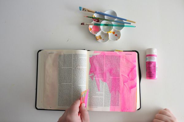
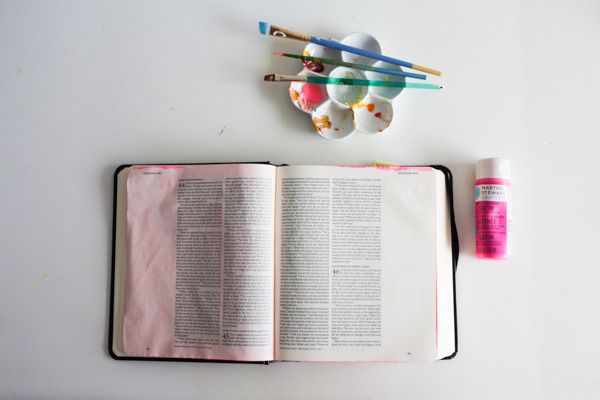
Craft paints are some of my favorite because of all the brilliant colors they come in! Today I am usingMartha Stewart paints and I got a little carried away but I am okay with that, the neon pink on top of all the pages is just fun! I like to apply these with just an old gift card, dragging it across the page. This will create a nice thin layer perfect for your pages!
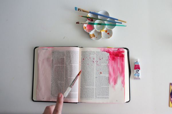
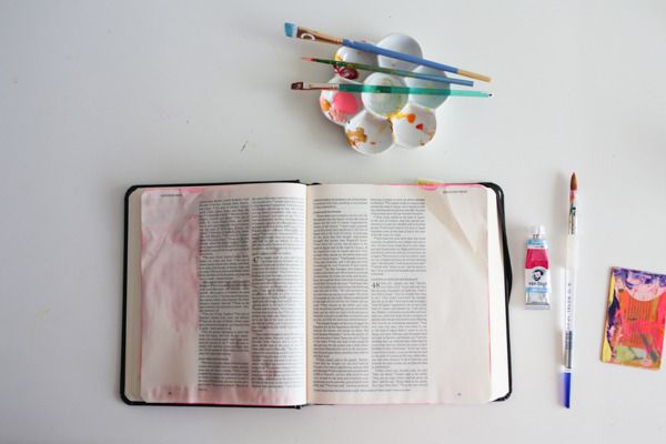
As I mentioned before I love watercolors and watercolors in a tube are even MORE fun! For my example I am using the Van Gogh paint which comes in this adorable little tube. You are going to want to think more about the pigment and less about the water here, and for this example I applied the paint directly to the page and then added a tiny bit of water later to just bring the pigment down the page. This one did bleed a tiny bit, but again this is up to your personal style and how much water you use.
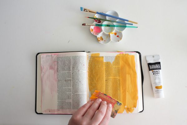
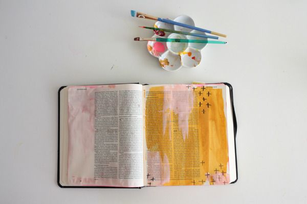
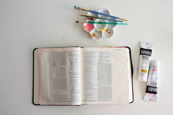
Up next is my favorite paint!! I love this liquitex heavy body paint. Since this is a “heavy body” paint it has a lot less water in the paint and all the pigment just sits on top of the page instead of soaking in. For my example here I just applied a bit of the yellow oxide with bits of the light portrait pink mixed in. I love how these colors don’t get muddy when you use them together!! I can’t wait to pick up more of these fun colors!!
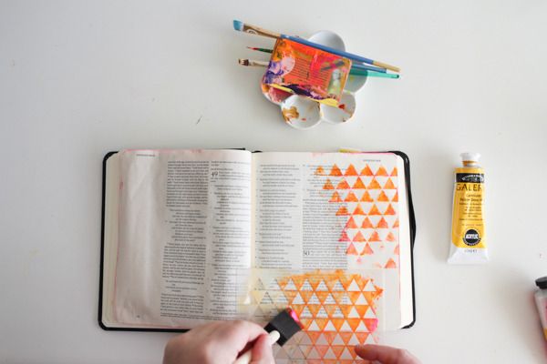
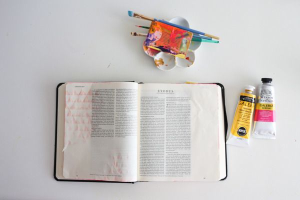
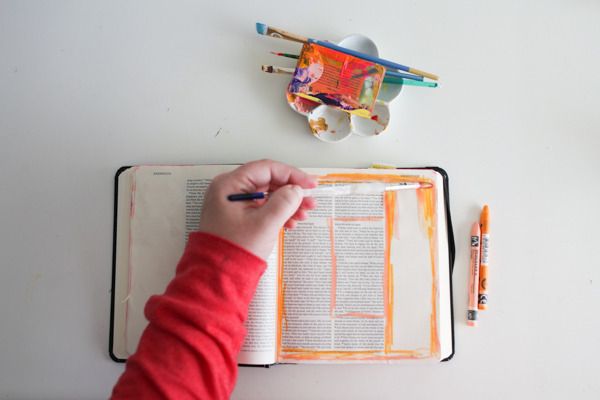
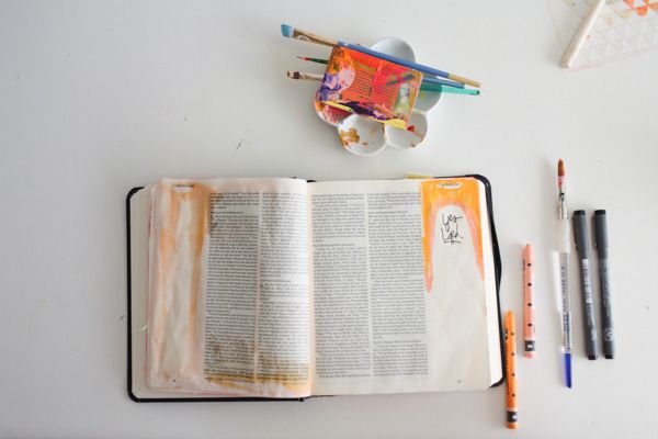
Apparently I love anything that comes in fun bright colors because when I passed these in the art supply store they just jumped into my cart! These are called galleria acrylics by Winsor & Newton (Opera Roseand Cadmium Yellow) They are very smooth paint and the colors just pop off your page! For my example I used with a mask and just had fun bringing that color across the page.
You already know my love of the neocolors but let’s just mention them again! I wanted to show you in my first example what can happen if you add too much color (you can see in the second photo on the left) it just gets crazy! But if you are more reserved with your water you will have much more success! The colors on the off white pages are just amazingly BEAUTIFUL!!!! I love these and can’t wait to use them more!
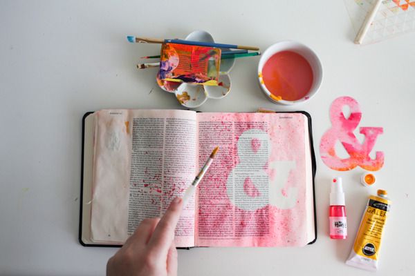
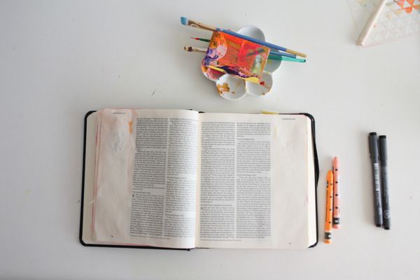
Last and certainly not least is MIST!!! I am slightly addicted and you would be hard pressed to find a page where I didn’t add a touch of mist to it! For this example I wanted a full page of mist and used anampersand mask with mister huey. You can see that it can get the page a little wet but if you only spray once or twice it won’t soak through. I am so sorry I don’t have a backside photo here, I just got to excited I suppose!!
I hope this answers some of your questions on what types of paints to use! Have fun and get creative!!!
xox -Shanna