Wow, only one more day left of 2011! It is hard to believe that another 365 days has flown by so quickly, but I am looking forward to 2012 and all that it will bring.
The first Demo Day of 2012 will be happening on Saturday, January 14th from 11 - 4 pm. As always, we will have fantastic projects for you to create and we will help guide you through them. My card will use a stamp from MFT (My Favorite Things) though I will also bring along some basic sentiments that could be used instead, and a gorgeous paper from Basic Grey's Little Black Dress line (which I think Gina A gave a shout out about in another post) - this paper line is stunning!
One of my objectives when creating cards is to use layouts that can be used over and over again for many different occasions. The card I've created for Demo Day is one of those kinds of cards.
On a personal note, I just want to say a huge thank you to everyone that I have gotten to know over the past few years of working and teaching at Photo Scraps. So many of you have become friends and I feel so blessed to be able to share doing something that I love with so many people. You have inspired and encouraged me, and I hope that I have given that back to you. I look forward to seeing you throughout 2012.
Best wishes for a Happy New Year!
Cindy
Friday, December 30, 2011
Tuesday, December 27, 2011
Holiday greetings from Gina A!
Hope all of you are enjoying a wonderful holiday season!
I didn't have much time for blogging in these last weeks leading up to Christmas because I was busy CREATING! Stop in the store soon to see the sample treat bag and luminaria jar (in the mason jar) that I gave as gifts this year. Tracy is also posting a photo here of the frame I decoupaged for my daughter. I used one of our TPC Studio chipboard frames and altered it with black and white papers from my stash and the new Basic Grey "Little Black Dress" line (if you haven't seen this yet we have a beautiful selection in the store!) After the modge-podge dried I added a finish of Glossy Accents and I love the result! This is a good example of an idea you could "scraplift" for yourself or your gift-giving occasions in the new year.
And speaking of new years... I wish each of you a happy, healthy and successful 2012! It has been my pleasure to meet and get to know so many of you during my shifts in the store, as students in my classes, and/or as fellow crafters at the many Photoscraps Crops throughout the past year. I hope to see all of you often in 2012!
Happy new year!
Gina A.
Thursday, December 22, 2011
NEW CLASS: Flopsey Cards
If you have your own Copics, please bring them with you. Here is a list of colors we will be using:
N0
B02, B05, B21, B91
YG23
W1
R27, R83
BG10, BG15
C1
YR04, YR18
E23, E29, E31, E33
RV34
This class will be available as a kit if you are unable to attend in person. Please let the store know you will need a kit when you call to register for the class.
I wish each and every one of you a Happy New Year. I look forward to seeing you soon!
Cindy
Friday, December 16, 2011
Where has the time gone?
Wow, only a week until Christmas! Where has the time gone? It seems as if November and most of December have just disappeared in a flash. It hit me today that I had completely forgotten to post some of the Design Team cards I made using the fabulous Winter Twig from Little Yellow Bicycle. This paper line is just terrific, from it's patterns and colors to it's slight texturing on the papers.
One of my cards I was happy with, the other did not turn out the way I had pictured it but I wanted to show it to you anyway. We all have those projects that we are not quite thrilled with once completed, but don't dislike them enough to throw them away. Believe me, I've had my share of throw-aways...if you could only see the trashcan under my desk right now. Can you guess which card I was not quite happy with?
My first card uses the front and back side of one piece of paper. I added the sentiment (Hero Arts) in brown, edged the entire card with white Staz-On to give it a snowy look (ruined my pad...here's a tip...don't ink edges directly with the white Staz On ink pad...use a dauber), and finished it with a snowflake cut from wool-blend felt and a Spellbinders die and another snowflake cut from Best Creations glitter paper (gorgeous!) then a ribbon and some twine colored with a Copic marker to finish it off. One of the great things about Copics is that you can custom color your embellishments to match your projects.
If I don't see you before the holidays, I wish all of you a Merry Christmas, a Happy Hanukkah, and a Happy Everything that you may celebrate at this time of year!
Cindy
One of my cards I was happy with, the other did not turn out the way I had pictured it but I wanted to show it to you anyway. We all have those projects that we are not quite thrilled with once completed, but don't dislike them enough to throw them away. Believe me, I've had my share of throw-aways...if you could only see the trashcan under my desk right now. Can you guess which card I was not quite happy with?
My first card uses the front and back side of one piece of paper. I added the sentiment (Hero Arts) in brown, edged the entire card with white Staz-On to give it a snowy look (ruined my pad...here's a tip...don't ink edges directly with the white Staz On ink pad...use a dauber), and finished it with a snowflake cut from wool-blend felt and a Spellbinders die and another snowflake cut from Best Creations glitter paper (gorgeous!) then a ribbon and some twine colored with a Copic marker to finish it off. One of the great things about Copics is that you can custom color your embellishments to match your projects.
My second card uses the beautiful bird stamp from Hero Arts and wood grain paper from Winter Twig. I turned the patterned paper so that it was running horizontally. The stamp was heat embossed with Stampendous white embossing powder (my favorite white EP), then stamped the sentiment in Faded Jeans Distress ink and popped it up on a little flag. Some bling finishes off the card.
If I don't see you before the holidays, I wish all of you a Merry Christmas, a Happy Hanukkah, and a Happy Everything that you may celebrate at this time of year!
Cindy
Friday, December 9, 2011
winter twig
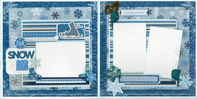
If you are like me, you may not be ready for snow yet, but just like Christmas, it will be here before you know it! And if you are like me, you already have snow pictures from our freak storm on October 29th! So it is a good thing we have already got a new winter line from LYB called winter twig. I used 3 different paper prints and a variety of embelishments from this line to make my 2 page spread. I also used color box ink in blue lagoon (my fav.) to distress edges of white cardstock to make them pop off the page. While getting design inspiration from a magazine, I read an article about "clustering". You may already do this and not know there was a term for your design! It consists of grouping things (like photos, words, or embelishments) together on your page by layering to add balance to a title or ground a journal spot, or even draw the eyes to your photos. I like it because it allows you to use many embelishments together without looking junky! So I went nuts with chip elements, transparancies, cardstock stickers, chip titles, and label stickers! They also have borders and cool snow flakes to add to your projects, even some embelishments with glitter for those of us who like some sparkle! I played with my large variety of embelishments until I got it clustered enough for my eyes to enjoy without being overpowered by stuff on my pages. Remember, there is no wrong way in scrapbooking, only how your eyes like to see things! So try something new, like clustering, I am going to try clustering something else next month!
Sunday, November 27, 2011
December's Demo Day card
Demo Day is one week earlier than usual for the month of December. Join us on Saturday December 10th from 11 - 4 pm for Demo Day!
If you have not been in the past few months, I highly encourage you to come on out and make some great projects. Lines at each table have virtually been eliminated since we have changed up our seating arrangements, so no more waiting to get at your favorite project tables.
Here is the card we will be making at my table. It is quick and easy and the blue/silver/white combination is perfect for winter (which may eventually get here even though several of my daffodils bloomed today). This is a great card for Christmas, Winter, or just the holiday season. You could also use it just to say "hi" to a friend. I will have a few different sentiments on the table, or you can skip the sentiment all together if you like.
I hope each and every one of you had a wonderful Thanksgiving, and I look forward to seeing you on Demo Day!
Cindy
Tuesday, November 22, 2011
Snow Fun with Gina A!
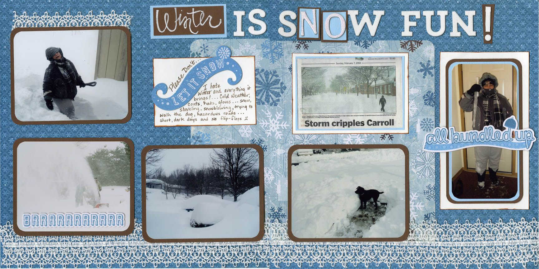
I LOVE Little Yellow Bicycle papers and products - the papers always have such a nice texture/weight to them and the designs are always beautiful BUT I have to admit I wasn't happy to see SNOW THEME paper already!!! I'm a gal who does NOT like winter weather, snow, etc. so I decided to do this layout with a little play on words to show my dislike of snowy weather. I love how my simple layout looks special using the LYB papers and some lacy ribbon. Notice how I highlighted the 'N' 'O' in SNOW on my "Winter is SNOW Fun" title! Even if you don't like the cold wintry weather, you probably have some snowy photos like I did so have some fun creating!
Gina A.
Gina A.
Monday, November 21, 2011
Ice Skating!!
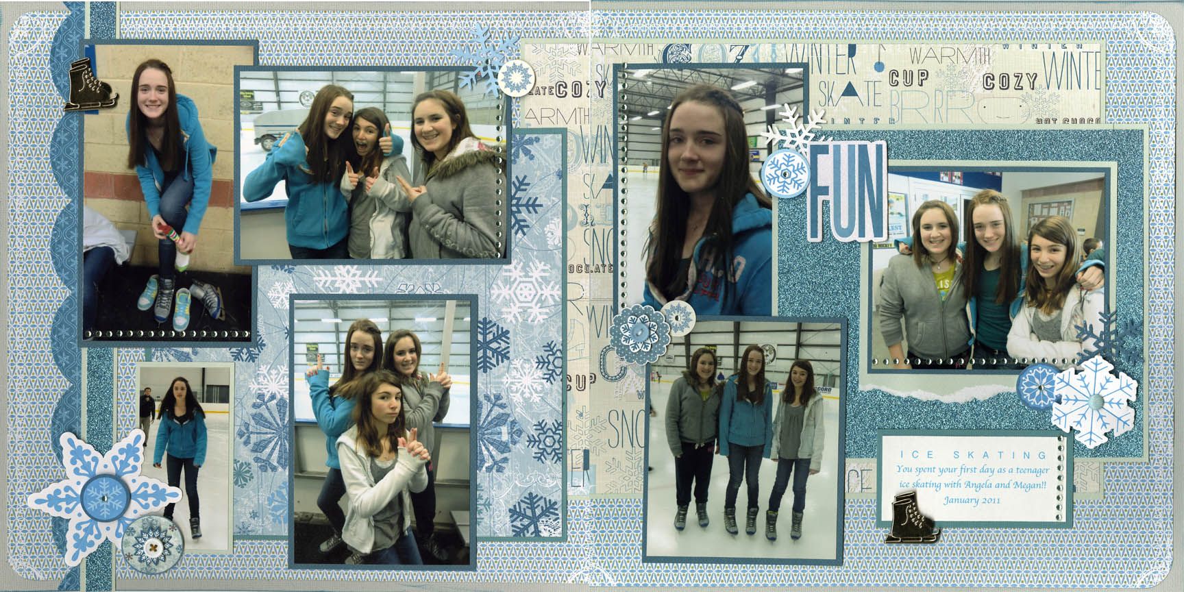
Oooooo la la, I am loving me some of that Winter Twig line, new from Little Yellow Bicycle!! The many, many shades of blue in these papers are fab--you have got to see them for yourself! I chose pictures from my daughter ice skating and really appreciated that she wore a blue hoodie that day to coordinate oh so well with the papers. (that girl is so thoughtful! heehee) I used a border punch on the left side and some glorious blue glitter paper from Best Creations on this layout also. These pages screamed for bling and so bling it is....lots of blue bling! Hope to see you in the store soon. Lisa H. :)
Sunday, November 20, 2011
Cherry Blossoms!!
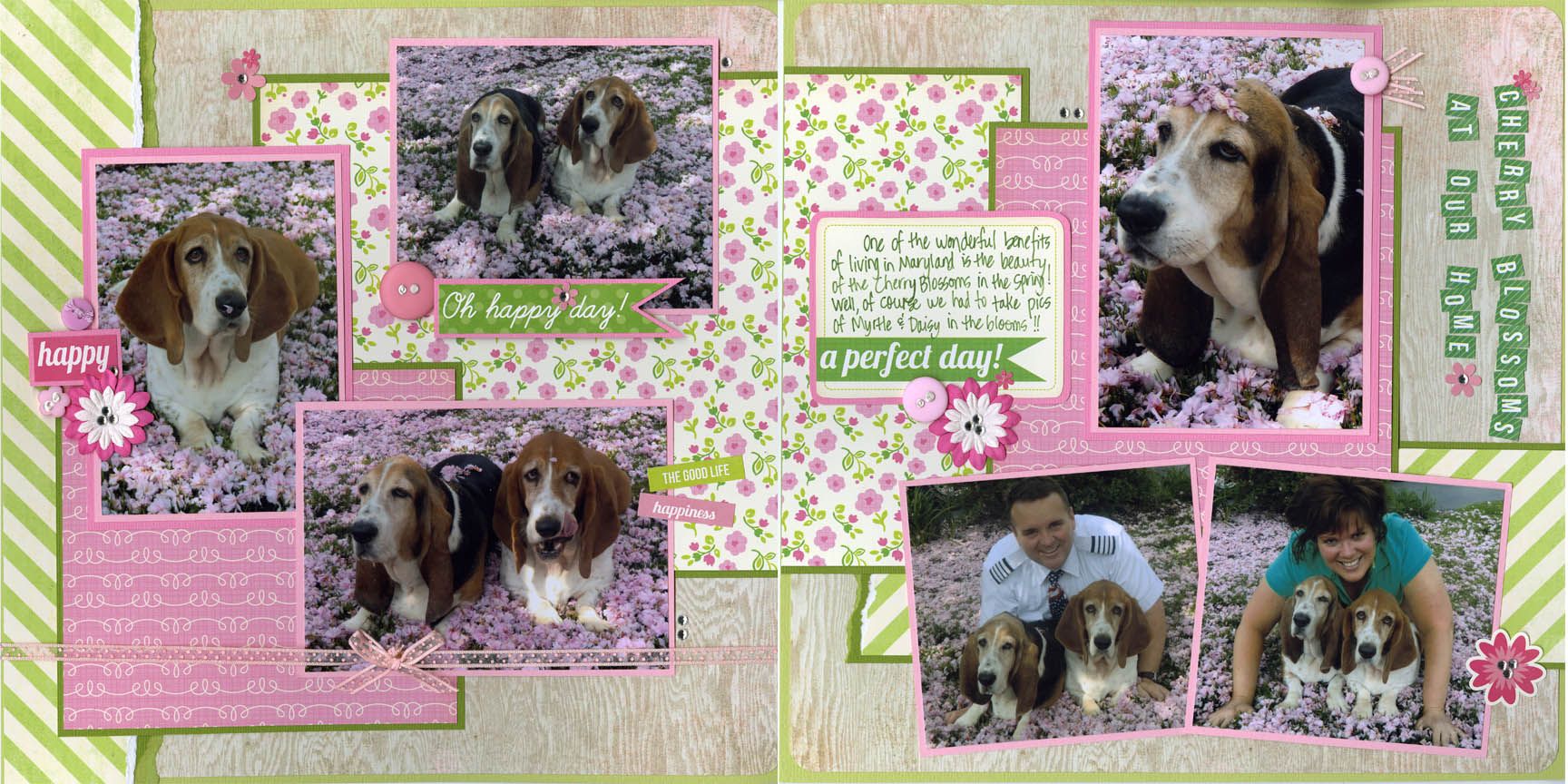
I fell in love with this awesome kit from Echo Park called Country Drive; the papers were so darn adorable!! The papers that jumped out the most were the pink and green ones from this kit and I remembered some fun happy pictures we took of our dogs in the front yard in the spring. I just love how this layout turned out....so springy!! The finishing touches on these pages were lots of bling, pop-dots, liquid pearls, buttons and ribbon. Hope you like this layout and it gives you inspiration to scrap some pictures of your pets, or your kids, or just the beautiful cherry blossoms in the spring!! See you soon! Lisa H.
Saturday, November 19, 2011
The 3/50 Project - Pick 3. Spend $50.
The 3/50 Project - Pick 3. Spend $50.
**All it takes is just one person to start a trend...will that person be you?
When you think of the community that you live and shop in, there are 3 very important things you need to consider.
1) What 3 independently owned businesses would you miss if they disappeared?
Is it us - Scrapbooks Too? What about your mom n' pop grocery store that you "just run into" occasionally for those last minute items? How about the cute little clothing boutique where you bought your favorite outfit? Or the cool little pet supply store on the corner where you got those awesome toys that your animals just adore?
2) Did you know if half the employed population spent $50 each month in locally owned independent businesses, it would generate more than $42.6 billion in revenue. Imagine the positive impact if 3/4 the employed population did that!
3) Are you aware that for every $100 spent in locally owned independent stores, $68 returns to the community through taxes, payroll, and other expenditures. If you spend that money in a national chain store, only $43 stays here. If you shop online, nothing comes home!
The 3/50 project idea is to commit $50 each month to locally owned businesses, total. Maybe that means rethinking where you currently invest your money, opting to pick up that birthday card or pair of jeans in a locally owned business instead of the big box you’ve been going to. Or maybe it means eating out just once a month because you realize slamming the brakes on all spending stalls economic recovery. It’s just that simple.
This Project isn’t an “all or nothing” campaign that insists consumers stop shopping in chains or franchises. Instead, the message is about balance-—of the money you currently spend each month. We simply ask you to redirect an affordable $50 back to the locally owned independent businesses that have been forgotten of late. Just as there are things in a locally owned store that you can’t find in a big box, there are also things in a big box you can’t find in a locally owned store. We simply need to think about where our dollars are best invested, consider the greater amount of revenue local businesses return to the community, then purchase accordingly. Otherwise, local economies suffer irreparable harm - as we have seen lately with lots of empty buildings and stories on the news.
For more information please click on the following link:
www.the350project.net/home.html
Thursday, November 17, 2011
New class!
Join me Saturday December 3rd from 12 - 3 pm for an all new class! This one is Christmas and Winter themed. We will be making a total of 8 cards (2 of each of the 4 designs). We will be coloring with Copics, heat embossing, and having fun making some great cards. We will be doing some detail cutting, so please bring SHARP scissors.
Here is a list of Copic colors in case you wish to bring your own:
B32, YG23, YG17, C7, C5, YR65, R29, R89, R37, Y19
Other items that you can bring if you own them:
Distress inks and a sponge dauber for each color: Antique Linen, Vintage Photo
This class is available as a kit if you cannot make it in person. Please let the store know you need a kit when you call to register.
This is my last class of 2011, but don't worry because I will have more classes for you in 2012.
I look forward to seeing you soon!
Cindy
Monday, November 14, 2011
Winter Memories with LYB
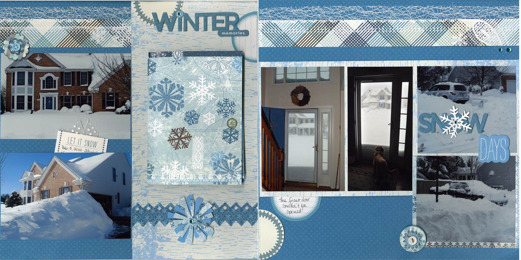
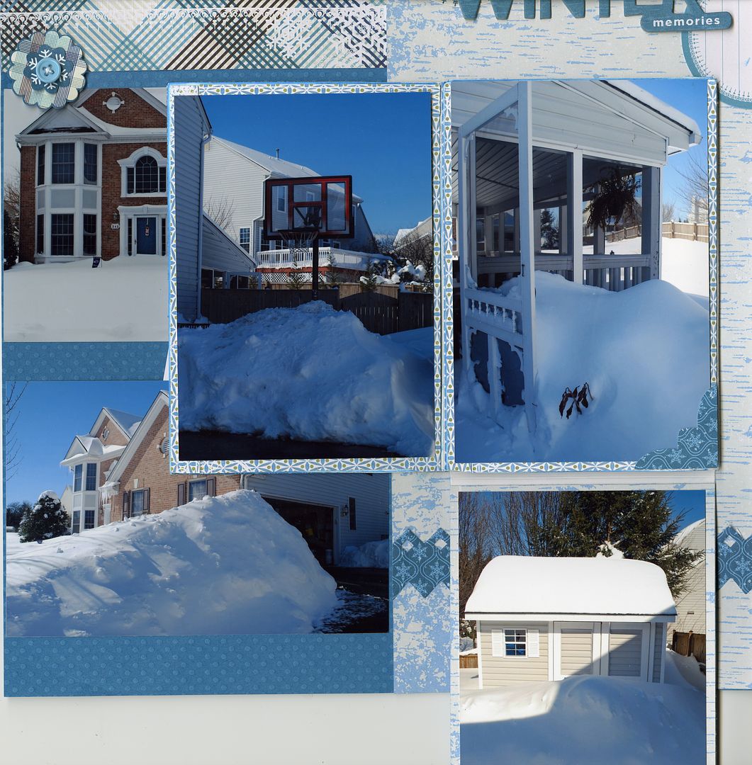
Winter Twig from Little Yellow Bicycle is the perfect line to get me in the mood for a snowy winter! I took so many pictures of Blizzard '10 that I have not finished scrapping them all. This layout has 13 (Yes, 13!) photos with 7 of them hidden in the "Large Photo Fold Out" from Creek Bank Creations. I simply mounted the fold-out onto my layout and covered each flap, front & back, with paper and/or photos. A short length of baker's twine and a brad serve as the closure. Easy, fast, and utilizes lots of photos!
Wednesday, November 9, 2011
Some Amazing Layouts from Jessica Mannarino
Hi Everyone,
We saw some fabulous layouts today from one of our wonderful customers, Jessica Mannarino. I love how she uses paint and sewing on her layouts. Jessica used a snowflake stencil on this layout then lightly coated it with paint.
We saw some fabulous layouts today from one of our wonderful customers, Jessica Mannarino. I love how she uses paint and sewing on her layouts. Jessica used a snowflake stencil on this layout then lightly coated it with paint.
Jessica keeps her sewing machine handy. I love how she stitched a star and then inked it up.
The simple stitched frames on this page really makes the page pop.
Here she used paint to make the cardstock look like wood planks and finished it off with some sewing.
Tuesday, November 8, 2011
Faboulous Customer Creations
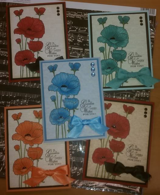
Some stamps just beg to be colored. Annabelle Kratz made these stunning poppy cards in a rainbow of colors. She used Copic Markers to get great shading on her flowers. To get the perfectly matched bows, she colored her white ribbon with the Copic colors of her flowers.
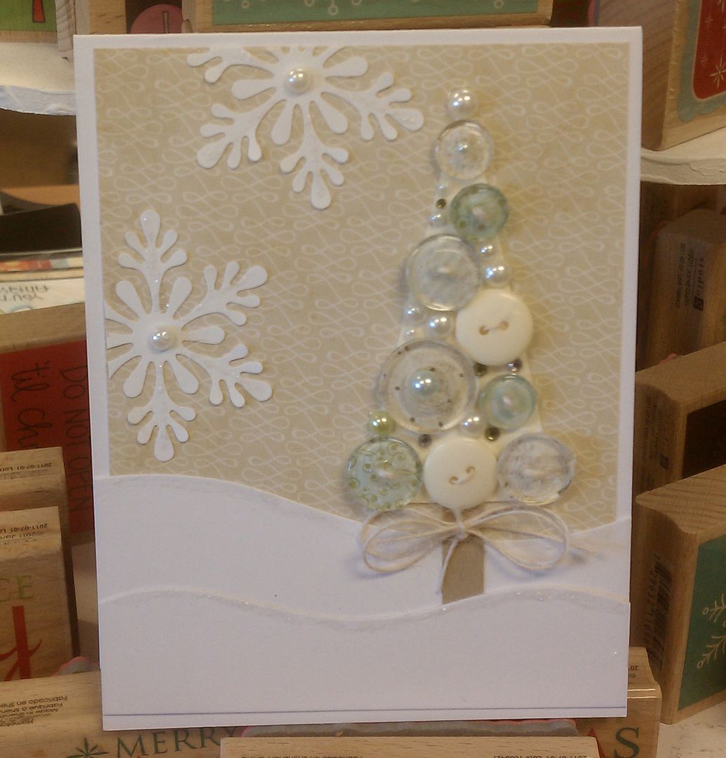
Laura shared some of her wonderful cards with us! We always love getting her samples. Even what looks like a simple card has layers of details. This Christmas tree card is a great example of that.
Laura used clear buttons and backed them with papers to give a sibtle look of color. All of the button centers are either threaded or topped with a pearl.
These two Laura cards were made completely from paper with no stamping. The ribbon and threaded buttons add that perfect finishing touch.
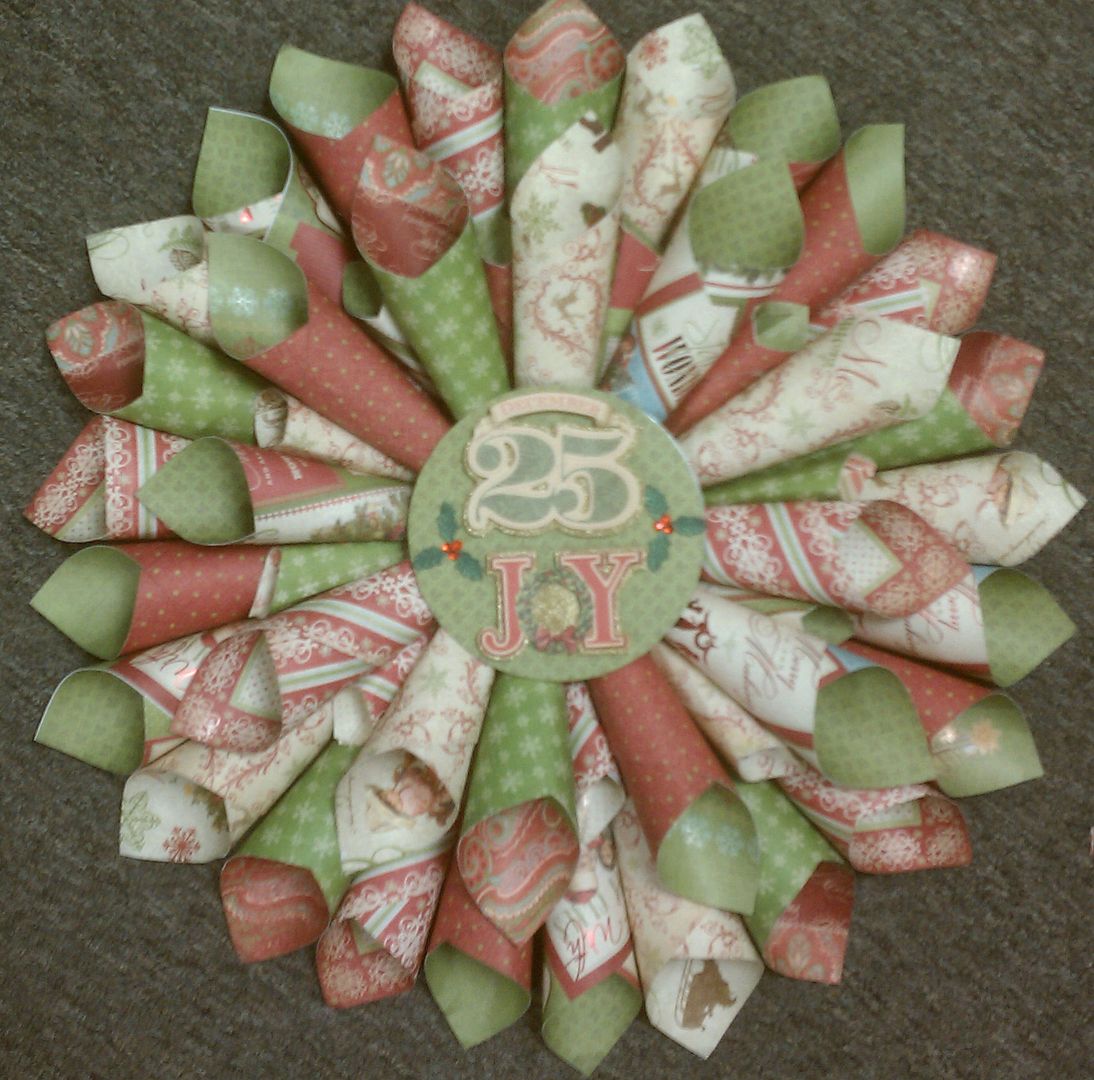
Paulette Hall took our wreath class last year and has discovered how much she loves making these wreaths. I love how she has started making these for different holidays.
My English-major daughter might not be pleased with all the exclamation points I use when describing these journals but I just can't help being excited about these fun products!!! If you haven't gotten SMASHED yet this summer, take some time this Fall to play with these journals and embellishments. It's a great way to get started with scrapbooking or to take your scrapbooking to another level. And remember, once you try something new your creative juices are bound to flow through your traditional projects too!
Happy Scrappin!
Gina A
Happy Scrappin!
Gina A
Monday, November 7, 2011
Gina A. is getting SMASHED!
So how much fun are you having with your new SMASH products??? I'm having a blast playing with my SMASH book and embellishments AND my new Fancy Pants journals and I wanted to share some of what I've been doing!!!
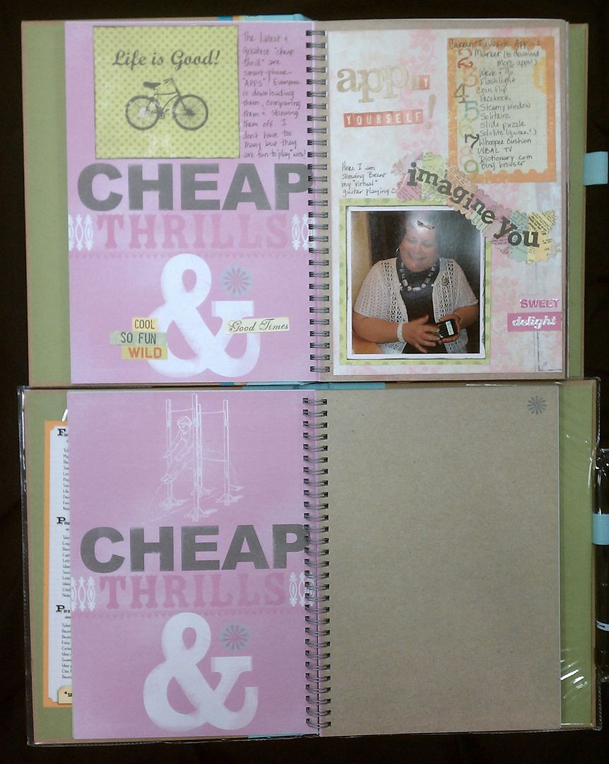
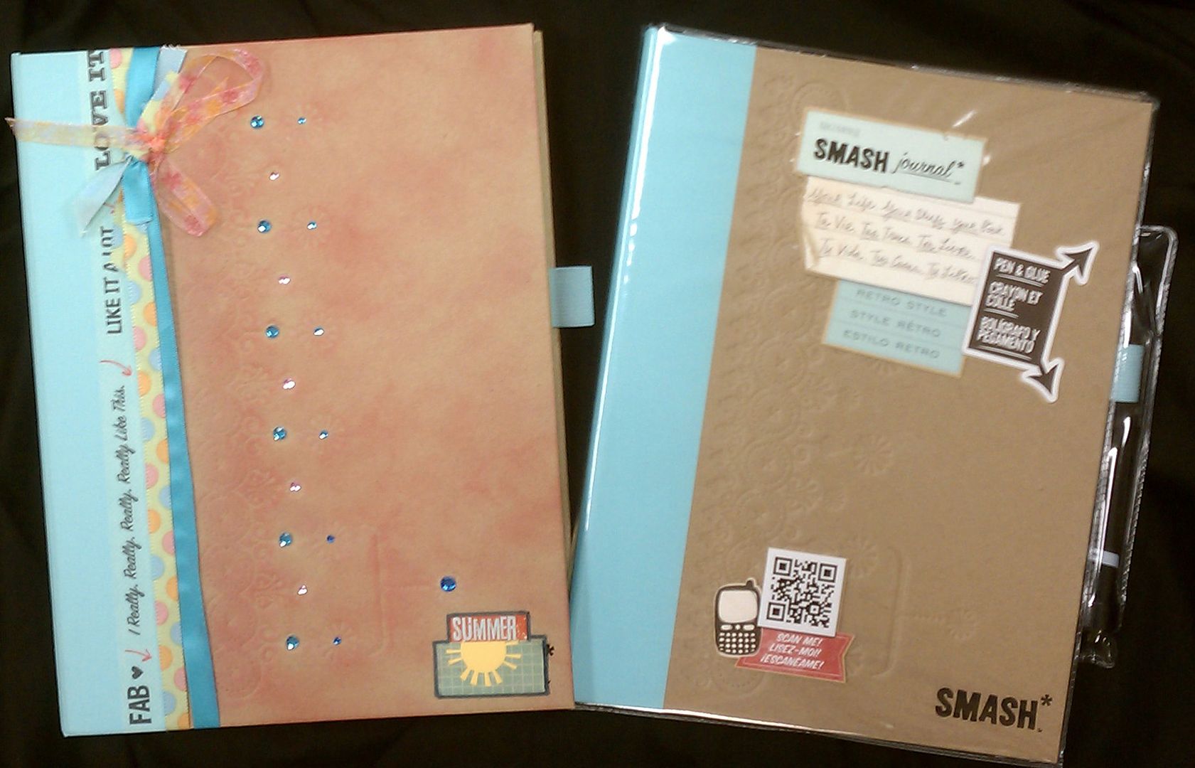
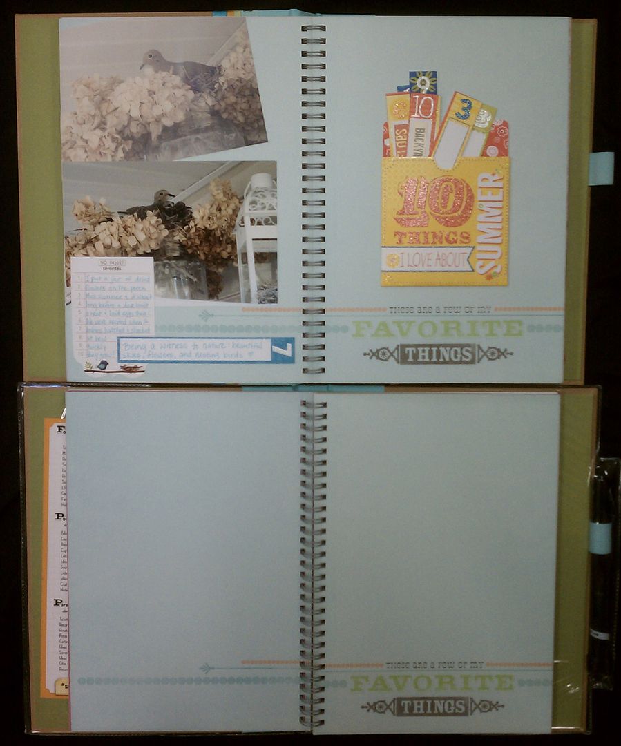
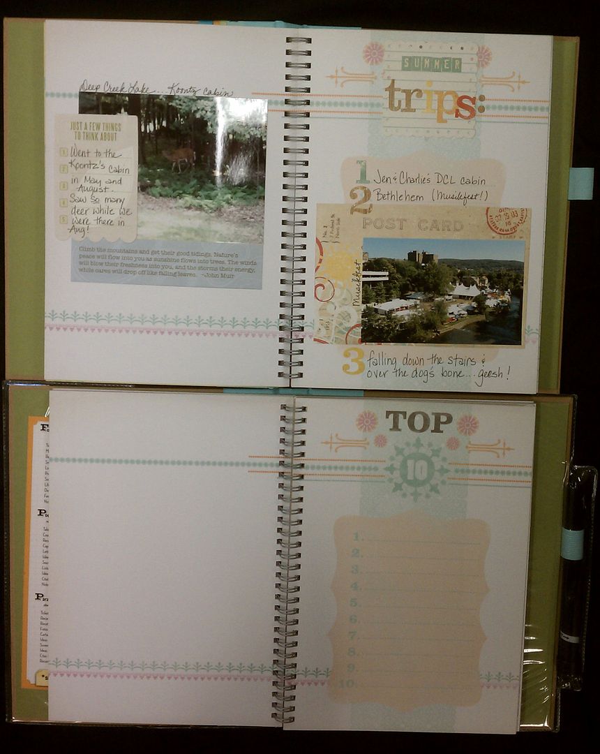
Yes, these books are great for use as straight-out journals but I'm using mine as mini scrapbooks of sorts. I started with the blue SMASH journal and decided to use it for my annual "summer" mini book this year. What's fun is using the pre-printed pages as starting points or "prompts" for journaling or page ideas. If you look through these books however and see pages that don't scream "YOU", remember you can just rip them out or cover them up as I've done! Here's some examples of "before and after" shots from my SMASH book.
Yes, these books are great for use as straight-out journals but I'm using mine as mini scrapbooks of sorts. I started with the blue SMASH journal and decided to use it for my annual "summer" mini book this year. What's fun is using the pre-printed pages as starting points or "prompts" for journaling or page ideas. If you look through these books however and see pages that don't scream "YOU", remember you can just rip them out or cover them up as I've done! Here's some examples of "before and after" shots from my SMASH book.
Friday, November 4, 2011
Yummy's !!
While visiting Ocean City with friends this summer, we popped into the cutest darn shop called Yummy's. And, you guessed it....it sold nothing but yummy confections. I was so taken with the adorable decor and bought quite a few cupcakes (as to not be rude, of course!!) The pictures from that day turned out so fun so I thought I would make a layout about it. The new line from Three Bugs in a Rug called (appropriately) Bake me a Cake was the perfect choice for these pictures. I used the hot pink dot as my background papers and then used 3 different papers on the pages. I used a Martha border punch to make the blue border on the far right nad the sticker sheet that came with the line also. Using smaller photos (2x3inches) on a lot of the pics helped make this layout so fun and you can have those printed right here at Photo Scraps while you wait. I used aqua ink with my home printer to jazz up the journaling and I think that makes it all the more adorable. Hope you like it! Lisa H.
Thursday, November 3, 2011
The perfect Christmas tree!!
Sorry my design team entry is a tad late this month....I have been just a bit busy with the Silent Auction, which by the way raised a terrific amount of money!! Thank you to all our amazing customers who participated in this great cause last weekend. We will continue to sell pink rubber ducks, pens and mints for the rest of the month of October...all for Breast Cancer Awareness month, so please check those out the next time you are in the store.
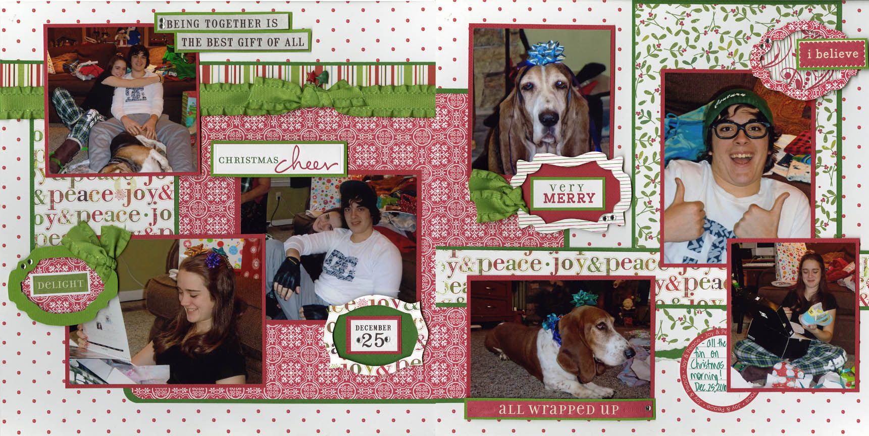
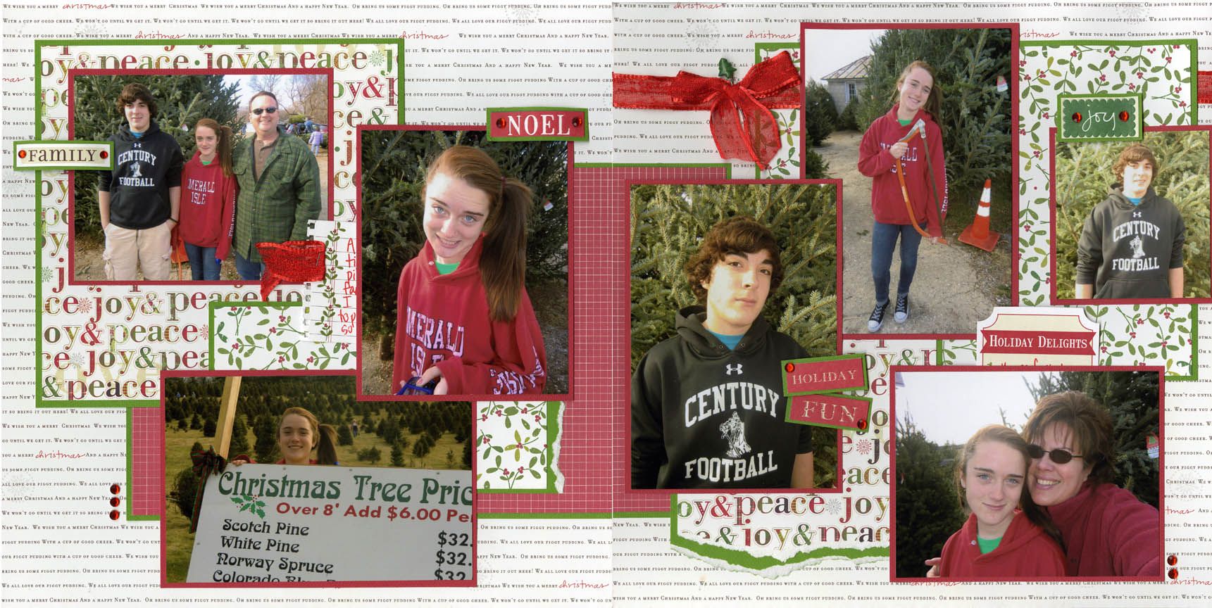
Now, back to my layout.....I just LOVED this line by Little Yellow Bicycle. The "word" paper I used as my two background pages was my absolute favorite!! Mixing and matching several other decorative papers from this line is my go-to plan on most layouts. Completing the pages with ribbon, bling and an adorable tree stickpin finishes it off. Hope to see you soon!! Lisa H.
Now, back to my layout.....I just LOVED this line by Little Yellow Bicycle. The "word" paper I used as my two background pages was my absolute favorite!! Mixing and matching several other decorative papers from this line is my go-to plan on most layouts. Completing the pages with ribbon, bling and an adorable tree stickpin finishes it off. Hope to see you soon!! Lisa H.
Sunday, October 23, 2011
November's Demo Day card
Demo Day is a week earlier in November...don't forget! Here is the card we will be making at my table. It is quick and easy and lovely (I think so at least). The card features a gorgeous stamp from Penny Black, a beautiful paper from Authentique, a border punch, and an embellishment using the fabulous Spellbinders Layered Poinsettia die.
I look forward to seeing you on November 12th!
Cindy
I look forward to seeing you on November 12th!
Cindy
Friday, October 21, 2011
LYB Wonder & Wishes
Hi from Lisa C.
Who doesn't love the holiday season? With its brightly wrapped packages, stockings full of treasures and smiles on the children's faces, I know I sure do. I began this layout with two peices of Festive Red Flourish paper turned so that the thin stripes ran perpindicularly and the red flourish accents were in the outer upper corners. I further accented the flourishes with Stickles, bling and paper flowers from the Embellishment Kit. I layered several other printed papers from the line as the bases for my photos. From the Fabric Stickers I used a circle frame around one of my favorite photos and strung the adorable stockings across the first page. I added names to the stockings and lots of bling! The "Signs of the Season" title and journaling tag each came from We R Memory Keepers new line Peppermint Twist. The two lines complement each other beautifully!!! Playing with these festive lines is certainly getting me in the spirit!
Who doesn't love the holiday season? With its brightly wrapped packages, stockings full of treasures and smiles on the children's faces, I know I sure do. I began this layout with two peices of Festive Red Flourish paper turned so that the thin stripes ran perpindicularly and the red flourish accents were in the outer upper corners. I further accented the flourishes with Stickles, bling and paper flowers from the Embellishment Kit. I layered several other printed papers from the line as the bases for my photos. From the Fabric Stickers I used a circle frame around one of my favorite photos and strung the adorable stockings across the first page. I added names to the stockings and lots of bling! The "Signs of the Season" title and journaling tag each came from We R Memory Keepers new line Peppermint Twist. The two lines complement each other beautifully!!! Playing with these festive lines is certainly getting me in the spirit!
Thursday, October 20, 2011
Gina A. FALLS in love with LYB!
Hi everyone!
I was so excited to see Little Yellow Bicycle's new fall line, "Hello FALL!".
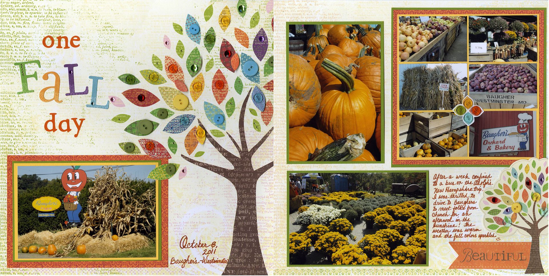
I immediately loved the "Autumn Tree" paper and thought it would be perfect for some pics from my day at Baugher's this past weekend. I had SOOOOO much fun embellishing the tree! First I used some of the die-cut leaves from the line's accompanying embellishment pack, pop-dotting them over the printed leaves on the paper. Then I added some buttons. Then, because I haven't "blinged"... um "blung?"... (LOL!) lately, I added some sparkle to the leaves... I just LOVE how it turned out!
The title "one Fall day" came from a stash of old orange letter stickers paired with the F-A-L-L letters in the embellishment pack (with a little more "bling" added!). (If you look closely you'll see I didn't have any "a's" or "d's" left among my orange letters so two "p's" (one with the stem cut off) fill the need.
In placing the photos I slit a couple of leaves on the tree with an exacto knife so I could slide the photo under. On the accompanying page I used some wallet-size pics to "set the scene". I use wallet-size photos often when I want to include more details or show sequence in a layout. I like matting them together as I did here, but remember to leave a little white space or matting around the photos so your eye can rest from all the busyness.
(Oh, by the way, if you visit Baugher's this season and would like to share my leftover wallet-size photos, next time you're in the store just ask! I have some on the shelf behind the front desk - my gift to you!)
If you're a paper-crafter who only dabbles in scrapbooking preferring cardmaking, etc., consider taking my 101 class to learn how you can make the leap into page design or the 102 class to take your scrapbooking to the next level and learn to use embellishments more!
Can't tell you how pleased I was when I brought this layout into the store and Lisa C. RAVED!! As I tell my 101 students, you should create for your own pleasure and to your own taste... but doesn't it feel good when someone else loves your work as much as you do???? :-)
Hope you all FALL in love with LYB's line this month!
Have fun!
Gina A.
Wednesday, October 19, 2011
Pretty little poinsettia
This is a super quick card I made last week using LYB's Christmas line and a new Spellbinders die called Layered Poinsettia. The LYB paper is just fantastic and the die is to die for! No pun intended :) This is one of those rare cards of mine that has no stamping, but I don't think stamping was even needed. My poinsettia uses all but one of the available die petals and the leaf petal. I gently curled my petals around a pencil to give them a dimensional look, and instead of die cutting my flower center, I used gold pearls.
Please call the store ASAP to special order the die if you want it. It is so popular this holiday season that it keeps walking out the door with a happy customer has soon as it comes in. Like all other Spellbinders dies, you can cut out the shapes then go back in and emboss for extra detail.
Remember to to look at the projects in person while you are shopping!
See you soon,
Cindy
The card:
The die set by Spellbinders:
Game On from Little Yellow Bicycle
Basketball by Lisa Castaneda
I don't know about you but I just LOVE sports lines! Between my three kids I have so many sports layouts to catch up on. Little Yellow Bicycle's new Game On collection was barely out of the shipping box when I was buying EVERYTHING to take home! This sports collection has things for Baseball, Football, Soccer and Basketball.
I don't know about you but I just LOVE sports lines! Between my three kids I have so many sports layouts to catch up on. Little Yellow Bicycle's new Game On collection was barely out of the shipping box when I was buying EVERYTHING to take home! This sports collection has things for Baseball, Football, Soccer and Basketball.
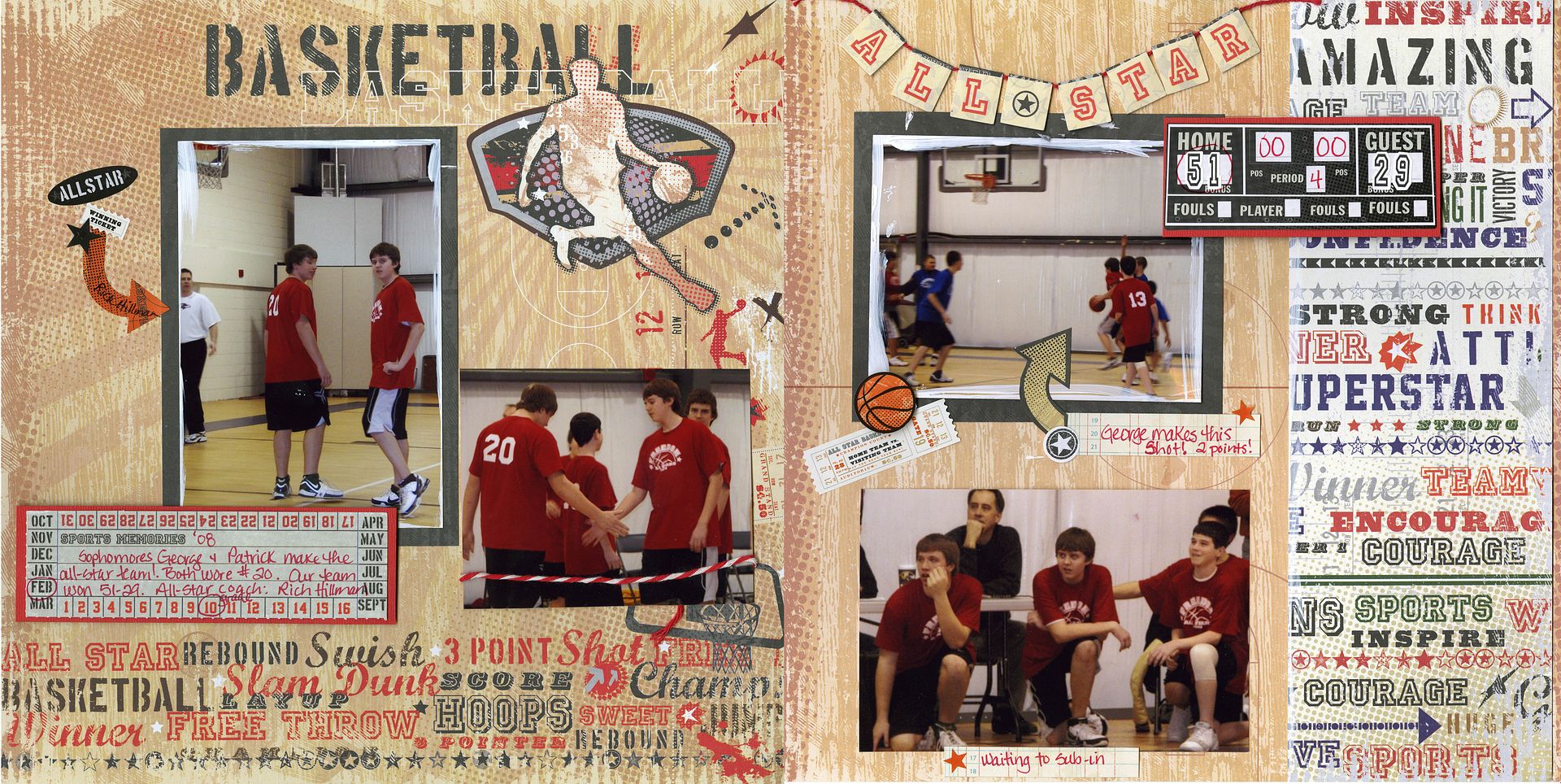
My first layout is from several years ago of my son's basketball all-star game. The paper is so beautifully designed that I felt there was little I had to do to make a great layout! I used a fun technique that I too often don't turn to . . . I painted the edges of my two favorite photos and the edges of the border I cut from one of the printed papers. What a quick & easy way to add a little pop! The mini-banners already had "All Star" printed on them so that made a no-brainer title. I used the stickers to embellish including the score board where I put the actual game's final score with the numbers included on the sticker sheet. The Tear-Out Ticket book gave me a fun journaling spot. Love, love, love this line! You have to come in to see it for yourself! (Plus, the Fab-O school line!)
Tuesday, October 11, 2011
October and LYB
October is always one of my favorite months of the year even though my allergies will totally disagree with me. Is anyone else out there as miserable with allergies as I am?? Enough about allergies and onto the Design Team's pick for October, Little Yellow Bicycle (LYB).
This month we are focusing on 2 lines from LYB, their Christmas line called Wonder Wishes and their Autumn line called Hello, Fall. First, I must say that I adore LYB. Their papers are strong and sturdy, their patterns playful, and their colors always appeal to me. I picked a little paper from both lines and am sharing with you 2 cards I've made from the Christmas line.
My first card uses the front and back sides of one piece of paper. I already threw away the strip that had the name on it (sorry!) but it has the poinsettia pattern on one side and the words to "We Wish You A Merry Christmas" on the flip side. I probably say this every month and in every single one of my classes, but I love words! I love the look of writing in every font imaginable and can never get enough of paper (or stamps for that matter) with words on it. For this card I used a sketch with lots of layers to give it depth and then added a simple sentiment by Hero Arts. This lovely Christmas stamp is from HA's newest release . The set is called "Very Merry Christmas" #CL543 and is a must for any stamper's holiday collection. It is a clear set with a bunch of Christmas sayings on it and while I have only had mine for a couple of months, I have already used it a ton of times. This sentiment is actually one of the long horizontal ones on the set. I cut so that I could make it stacked. Don't be afraid to cut your clear stamps! I stamped the sentiment in Black Cherry Staz On, my all-time favorite red ink. I added 1/2 of a die cut (Tim Holtz Ornamental die, a favorite of mine!), some pearls and some ribbon. I love love love the layout of this card and will probably be using it in an upcoming class.

My second card uses patterns from 2 different sheets of paper from LYB, but I loved how they matched up so well together. Because of the busy pattern on my die cut (Tim's Ornamental die again) I wanted something more simple for my background. My sentiment is from...you guessed it...the same Hero Arts set I used on my first card and is stamped in the same Staz On ink. The poinsettia is from Prima and the bling in the center of the flower is metallic decor from Hero Arts.

Does the layout of my 2nd card look familiar? I used it quite a few months ago for a Demo Day card. I always preach how you can use the same sketch over and over again for any occasion by changing up the paper and the stamps. This card is a great example of what I always talk about. And with having a sketch to follow, it made creating my card quick and easy.
Remember to check out all the great projects and pick up some of the Design Team's monthly pick the next time you are in the store.
I look forward to seeing you soon!
Cindy
Thursday, October 6, 2011
My October Demo Day card
Wednesday, October 5, 2011
A Star is Born
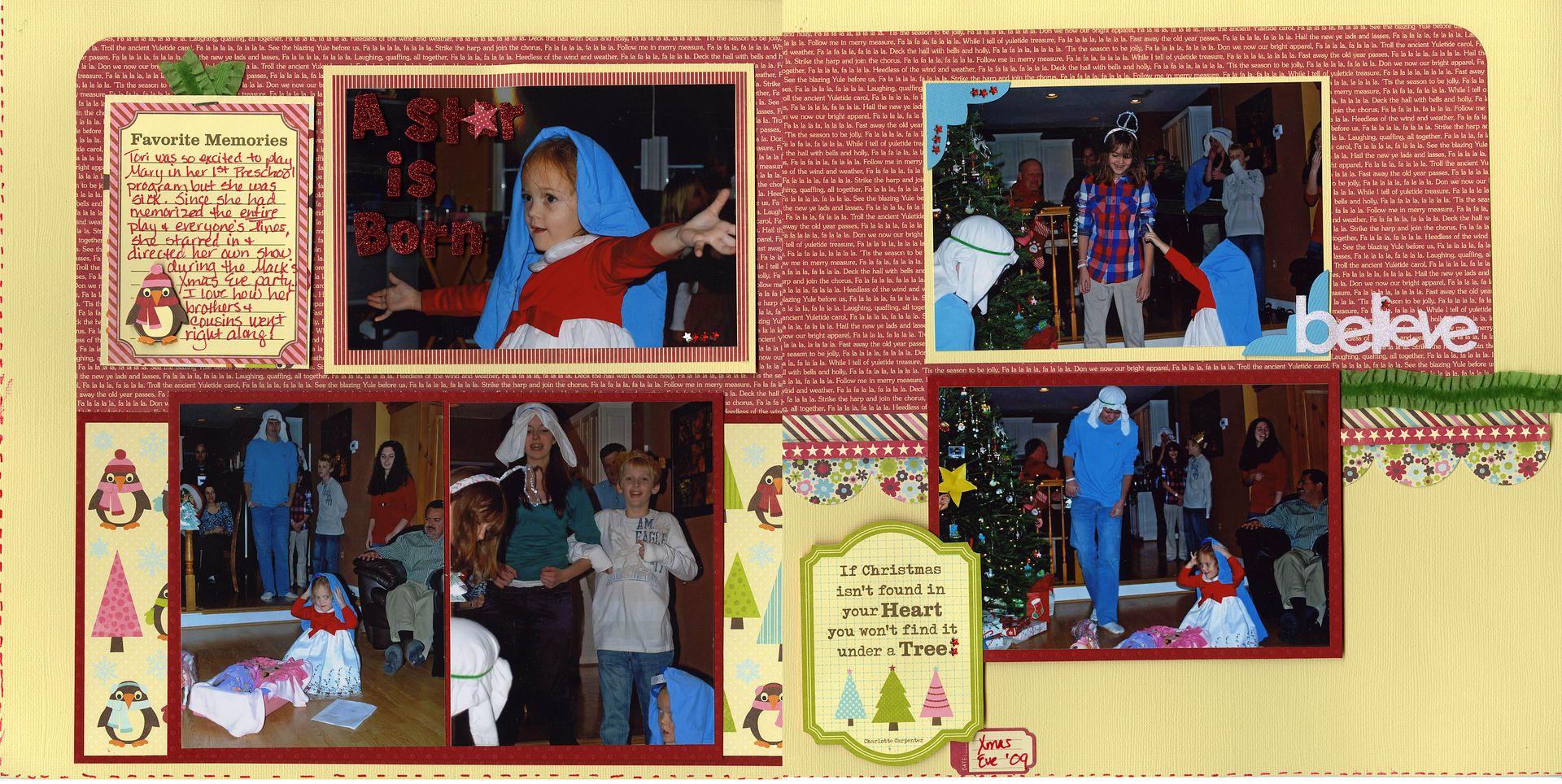
Jillibean's Christmas Eve Chowder collection is so cute and happy just like my neice Tori. In the layout "A Star is Born" Tori (at age 3) starred in her very own Christmas pageant on Christmas Eve at my sister's house. The best part of the "show" is that Tori convinced her brothers and cousins (up to age 17!!) to participate. It was such a gift for all of us to watch!
For the layout I combined some Bazzill dot paper and cardstock with Jillibean's whimsical prints. The journaling cards came right from the Bite Size Bits Uncut Sheet. I cut another penguin from the paper to layer on the one journal card so he popped right off the page. The borders on page two and other embellies came from the Pea Pod Diecuts sheet. The three borders can be used together as I did or separated. I chose to again use foam dots to raise one of the borders. The beautiful green ribbon is new from Webster's Pages and available by the yard. The "believe" sparkly word is from KI Memories.
Tuesday, October 4, 2011
Christmas card photo shoot!
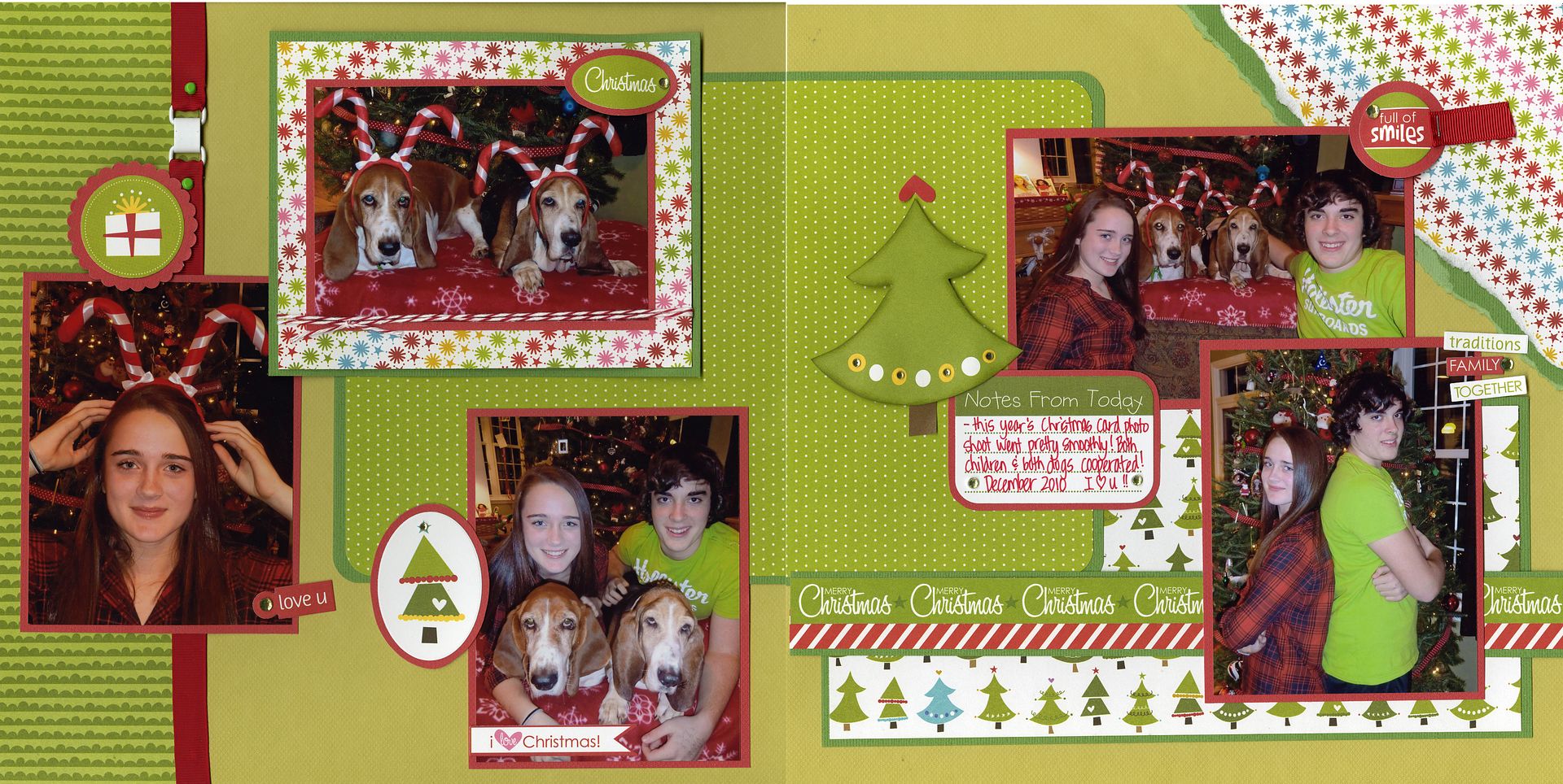
I love me some JilliBean! Their new lines are uber-fab....stay tuned to see what I have whipped up with the Halloween line. This Christmas line was too darn cute for words....I just love it! The happy tone of the papers was perfect for the mood of the pictures from last year's Christmas card photo shoot.....it is always a miracle when there is success with these pictures (between the goofy kids and crazed hound dogs!!). Lots of pop dots, mixing and matching of decorative papers, some ribbon, bling,etc. make these pages fun and lively. Hope this inspires you to scrap some Christmas pictures of your own. Enjoy the (finally) nice weather....Lisa H. :)
Friday, September 23, 2011
A Christmas card

Another Christmas card from the wonderful Design Team paper this month by Jillibean Soup. This card was inspired by my friend Emily. I used both patterns from a single sheet of paper, added a scalloped edge and a Prima poinsettia, some bling, and a beautiful new Hero Arts holiday stamp. Every year I tell myself that I am not going to buy any more Christmas stamps, and every year I do just the opposite of what I say! This Hero Arts set (CL543) is just gorgeous and has nice big sentiments to go on your Christmas cards. Love it!
Cindy
October 1st card class


Here are all the samples for the new card class on Saturday October 1st from 12 - 3 pm. We will be making 8 cards total (2 of each of the 4 designs). We will be doing a couple of fun and easy techniques too.
Copic markers: YR68, R29, YG17
Paint brushes or water pens (2)
Please bring these supplies if you own them:
Sharp scissors or distressing toolCopic markers: YR68, R29, YG17
Paint brushes or water pens (2)
I look forward to seeing you soon!
Cindy
Subscribe to:
Comments (Atom)


